
Corrupted Kingdoms (NSFW 18+)
PUBLIC RELEASE - v0.22.0 - INTERFACE OVERHAUL!
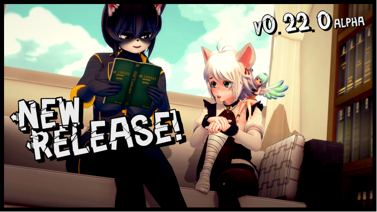
The latest update has been released!
(Want early access, plus extra goodies? Head on over to SubStar!)
As many of you may know, I've been wrestling with a number of personal and family matters since the beginning of August, and I haven't been in a great place. Story events I tried to write came out twisted and - frankly - unpleasant. So! This update is entirely devoted to a new UI overhaul I've been working on for a while. Partly because I need to set things up for some future mechanics, partly to clean up a lot of stuff that was getting way too messy, partly to make life a lot easier for translators in the future and partly because UI design is one way I cope with crippling depression! Apologies for those of you who were waiting for new story stuff, but I promise - there's tons of content coming in the next update! I hope you enjoy! :)
NOTE #1: Not all screens have been updated to the UI. If you see a screen using the old UI, don't panic, it's not a bug! I just didn't have time to rework it. All screens should be converted for the next update, plus a long-overdue refurbishment to the Gallery and Fan Art pages (to all the amazing artists who have been waiting for me to add their work to the game, I love you, and I will add everyone's incredible work to the new Fan Art gallery in the next update)!
NOTE #2: There's a decent chance that the new UI/X will have created a few edge cases, so please be patient and report on anything you find! Thank you, and sorry in advance for any inconvenience!
CHANGELOG:
- UI: A huge UI/X overhaul! Details are listed in the bullet points below:
- UI - DIALOGUE: Dialogue boxes are now slightly larger and more ornate to allow for longer dialogue chunks, a cleaner quick menu and to move away from the 'black boxes' aesthetic. New mechanics (coming in the next update) will iterate on the new design and add a fun new toy.
- UI - QUICK MENU: The Quick Menu has been moved from its distracting position at the top of the screen and into the dialogue box to give everyone a more pleasant-looking experience (and make things easier on PC players who had to keep popping open the top nav bar to get access to it)!
- UI - TOP MENU: The old nav bar at the top of the screen has been completely overhauled! The clock has moved to the centre of the screen and been given a sleeker look, and the old buttons in the top-right have been compiled into three new buttons: "Notes", "Inventory" and "Options".
- UI - CLOCK: The clock now has a new position and a new look! It will now be visible any time the general UI is (which will help prevent confusion in people who hid the top bar and then passed time) and will clearly display what time of day it is.
- UI - NOTES: Stats, Powers, Leads and Girls icons have been moved into the "Notes" icon to help keep the main screen looking a little cleaner and to reduce visual clutter.
- UI - OPTIONS: The old preferences screen has been renamed to "options" and given a sleek new look! Options are now divided into "Display", "Audio" and "Extras" categories for quick and easy scrolling to what you're looking for. Additionally, you can now hear preview sounds of Sound Effects, Vocal Effects and Clock Ticks with in the options menu so you can easily adjust each of the volume levels to your personal preference!
- UI - SAVE/LOAD: The Save/Load Screens have been given a massive visual overhaul! Save slots are now clearly numbered, and there are ten to a page. NOTE: I have had to resize the save thumbnails, but Ren'py doesn't apply this change retroactively! Your old saves will look weird until you overwrite them!
- UI - CHOICES: The Choices UI has be overhauled with new button graphics and new positioning. This MIGHT cause some weirdness in older events if there's more than five options on screen, so report any oddness you see!
- UI - SLEEP WITH SOMEONE: New UI added for when you select "sleep with someone"! (In Act Three only - I didn't have time to apply this to Act Two yet, sorry)! Now you'll get a fun little graphical UI which will allow you to pick the location and then the girl. This uses the new Avatar Portrait system that will be showing up in various mechanics in future updates!
- UI - LIVING ROOM: The dialogue options for "garden" and "bathroom" have been moved to "sub-location" icons, visible above the normal navigation icons at the bottom of the screen. This is something I'm experimenting with and may apply to other game areas.
- Bug: The "draggable" error that appeared for some people when trying to engage in combat has been fixed! This required an edit to the Ren'py SDK which SHOULD be fine, but report any weirdness!
- Bug: Wiki link on the main menu has been updated to point to the new and improved wiki. Thanks, team!
- Bug: Typo Hero has decided to give the Dread Arc a break this month and will stay home to sharpen his sowrd. I mean sword! Damnit!
I hope you enjoy this update! Next Early Access update will be Wednesday, 30th of September!
FAN TRANSLATIONS CAN BE FOUND ON THE CK DISCORD!
Comments
Log in with itch.io to leave a comment.
The interface is bugged out and it doesn't sit in the middle of the screen. now the options sit on the right side of my screen with the box poking out of my screen(its cut off)
And for those who haven't tried A House In The rift is also good to try while waiting or or Genex love
From what i am seeing it seems like everyone is forgetting that ARC is human and have a life outside of this.....its either have patience or uninstall 🙄 or check out other games like I do but when ARC does post i am right back on CK!!!
I don't like the new UI and why did you change the save game and load game UI
It's been months that I didn't play this and now there's... ACT 3?? AND ALOT OF CHANGES SINCE IM GONE?? (wow I missed alot of updates tho...)
LET'S FUCKING GOOOOOOOOOOOOOOOOOOOOOOOOOOOOOOOO
Arc is back gg wp
WAIT ACT 3 IS ALREADY OUT?
DID I MISS A LOT WHEN I THOUGHT I DIDN'T?
Yep tag time to play cache up (quack)
guess I shall!
please don't push yourself to hard. I'm going through a lot myself and I got told to not rush anything. You awesome and I wish I could get to know ya so please just take it one step at a time
I like the look so far but.. its a lil buggy :l
tu tranquilo men todos tenemos problemas y mas cuando es alguien de quiense espera mas asi q no le hagas caso a los llorones de abajo
the UI Broke the whole Game i can't even Click the Living Room
same too, the new UI broken all interface and is hard see some with all white when work. I prefer the old UI.
i wonder if the dev didn't check if the game was properly stable XD
Well they didn't have all that much time, shit is going rough for them right now, so how's about we cut them some slack
The trouble is, the family issues were the reason given for
Going from a once-weekly to biweekly
bimonthly break turning into a monthly break (He works 5 days a week but also takes a whole dev cycle off)
Dev cycle going to 1/month (He claims it's temporary, but so was the biweekly release schedule)
And now an entire month of "Oh I wrote a bunch of stuff but it sucked so here's a broken UI update, oh, and it's also crippling depression."
After a while, people get tired of endless poor-me BS.
It doesn't feel genuine, especially with Arc now being attached to another project.
Genuinely, I think this game is in the final stages of abandonment.
Oh, and coincidentally, it's time for his break next dev cycle, so the next update should be around December, and almost all the UI breaks should be fixed. But that'll be it.
Arc, if you're reading this, be better than MoolahMilk. Just say you have zero intent to finish this game, and stop taking money for almost nothing. These UI changes, they can't have taken more than 2 days, given there was absolutely no testing done. I've been a follower for a long time, and am a former Patron/Subscriber. But this? This is low, Arc. Real low.
Or maybe Arc actually is having problems and you should stop being an inconsiderate asshole. How do you know Arc actually is "faking" they're problems? All we know is that Arcs having problems we don't know how serious or demanding they are. And with the whole hurricane stuff happening anything could be going on. I'd be understanding of your reasoning but you just immediately assumed he's being a trashy human being at least give the Arc some time
I think MisterFawkes is honestly kinda right. I like this project and I also think he does too. Why would he waste time leaving a comment like this if he didn’t care about the project? Hell, why would he give money to it? I’m doubtful most you guys bashing him gave money…
Onto the actual points though, I don’t care too much about the UI change, but I agree that absolutely no testing was done on it, that much is clear from how content is being locked away due to the option boxes going off the screen, character pictures overlapping with the dialogue boxes meaning you can’t read names in Act 3, etc. While I don’t think the UI took only two days to make, I do think it should take less time than that to fix. If this was a free project and it wasn’t taking any money from anyone then sure, depression sucks, that’s understandable. But Arc is being PAID for this, as such there’s an expectation of results. You can’t promise a product and be paid to complete it, only to take constant breaks every other week. That’s just not how the real world works.
Go ahead, everyone. Downvote me like you did to MisterFawkes, but it doesn’t change the reality of the situation. If Arc wants a break, fine, but he needs to temporarily shut down his Patreon and such, because as it stands, it’s morally wrong and quite possibly illegal, depending on location. If this project is gonna be cancelled, that sucks and i’ll be very upset cuz I love this, it was my first game of this “genre”, but I feel worse for the people who donated to the Patreon for ages, giving away lots of money only for nothing to come of it.
The bug is coming up in this vision
I wish you well good Sir, you have hundreds if not thousands of people rooting for you. We will stand by you!
The dialogue boxes are a little wonky right now. Starting a new game, the light blue font for choosing a name is extremely difficult to read off the off-white background, and the text starts in the center of the box and goes off the screen. Also on the black screens with the text in the center, the BACK AUTO SKIP HIDE MENU buttons block the last half of the text. Not really sure what to do there, but I think I'll wait to play for a patch to fix some of this...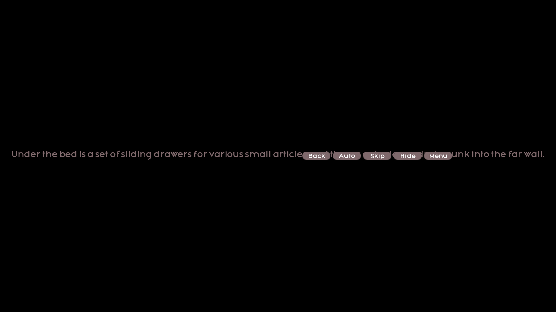
The living room in the manor seems to be completely broken. I got access to it after version 0.22.0, and at first going there would send me to my flat, but with all the manor buttons still enabled. After I left the manor for the first time, though, trying to go to the living room kicked me back to the title screen (I assume because the "flat" location no longer exists).
Also, for some reason, single-line narrative text on the black screen is written under the text controls, which is annoying.
Yeah living Room is completely bugged. Screws anyone trying to do Act 2 of the game as you physically cannot progress
Im having the same issue, that there might be something wrong as I was skipping a lot of text so I slowed it down and seemed to get back to where I was and had the same issue. At that point I tried avoiding the living room but eventually using any room or trying to skip time cause the game to the main menu screen.
I'm using a translator to write this so sorry for any mistakes. First of all, thanks for the update. I've been playing for a long time and I love the story (the main reason I keep playing), but about your new HUD that you put in, I need to say, it looks very strange. I play many games with the default Ren'py HUD so for me it was a strange feeling, especially because the colors don't match what I see of the game. I don't know if it's too difficult for you or if there's no way to do it, but could you put a way to turn on the old HUD? I say this as someone who started playing games on this engine because of your game and for me it's kind of strange to see my reference of good use of the engine distancing itself from it.
Hey Arc, you made an error with the date of the next update. It's kinda past the 30th of September now
nah we are talking about September 2025
I don't know how hard it would be to program, but would it be possible to add a slider to change the opacity of the text box? It would be nice to get a better view of the background, especially for more intimate scenes.
is this the limit of pregnancy or there will be more? (like gwen chloe qarinah or the humans we gather in the manor)
The paper dolls of most of my kids and most of the side girls are appearing over the dialogue box, pretty much always hiding the name of the person talking and occasionally some of the dialogue.
...which I don't necessarily mind, because MY KIDS ARE ADORABLE and I like seeing them more than some dialogue box or a silly name that I definitely remember anyway (for my kids or the girls, yes... for less common characters... maybe not).
Edit: Now some of the main girls are doing it, too (like Lily and Pixie... when talking to Lily).
In a slightly different problem, I now can barely see Lyx at all, because she's hidden behind everything. XD
I know you'll be adjusting things, but I still want to point stuff out.